Signal reliability
The identity is quiet enough to feel controlled and strong enough to remain memorable.
B2B · Electrical Construction
Building trust before the first site meeting.
01 · The business signal
Wipa operates in a category where the buyer is rarely looking for entertainment. Project managers, developers, facility managers and other professional clients need signals of reliability, precision, capacity and clear communication. The identity therefore had to build confidence before a tender, meeting or site visit ever began.
The design direction was deliberately restrained. Instead of making an electrical contractor look like a fashionable tech startup, the system makes discipline, modernity and operational seriousness visible.
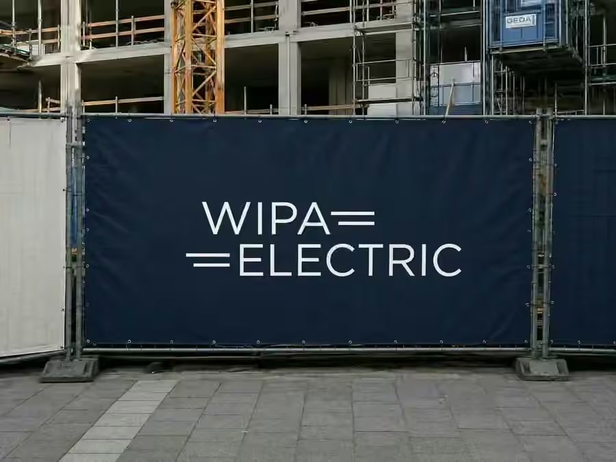
The brand system needed to perform in two worlds at once: the controlled world of proposals, websites and correspondence, and the physically messy world of construction sites. If the identity only worked in a presentation, it was not finished.
Design logic
Deep navy and white carry the primary identity. Warm neutrals keep documents and layouts from becoming sterile, while red is reserved for moments that need emphasis. Gotham Book and Medium were specified as a practical typographic family across website, print and correspondence.
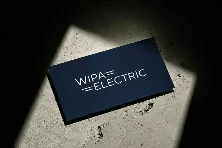
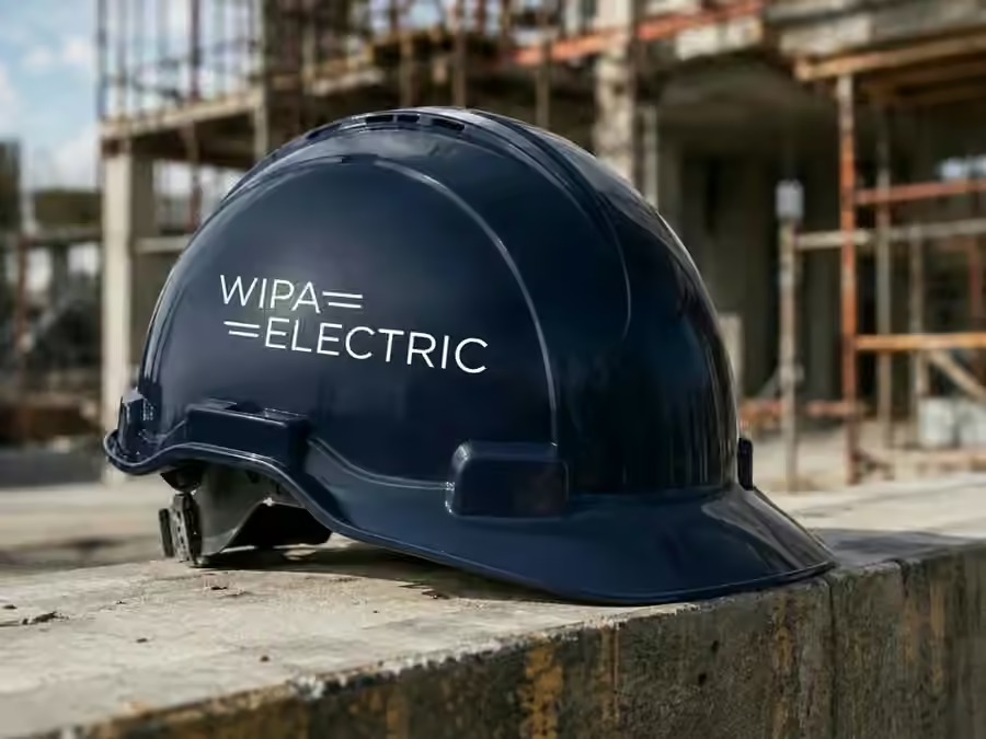
The identity is quiet enough to feel controlled and strong enough to remain memorable.
A business card, an email signature, a website and a construction fence need very different layouts but the same underlying logic.
On site, branding is not just exposure. It tells clients, partners and future employees what kind of company is behind the work.
Selected applications
The wider project includes the identity system and brand guidelines, business stationery, digital correspondence, website direction and execution, construction-site applications and a broader visual language for professional communication. The work shown here is intentionally a small edit, not the full deliverable list.