Invite curiosity
The first impression is energetic and easy to enter, not coded for insiders only.
Consumer Brand · Specialty Coffee
Making specialty coffee feel like a world to enter, not a club to qualify for.
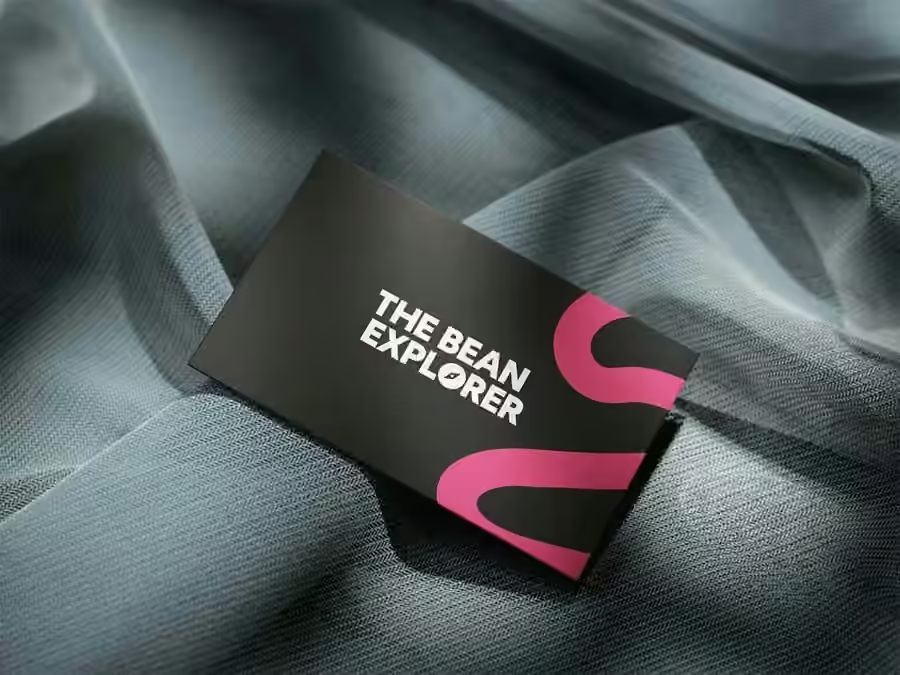
01 · The original idea
The early brief repeatedly came back to one behavior: discover. Discover beans from around the world, new flavor profiles, brewing tools and different ways to make better coffee at home. The brand therefore could not feel like a technical catalogue or an intimidating specialty-coffee institution.
At the same time, the business model was broader than bags of beans. The concept had to stretch into equipment, an espresso-machine rental offer, coffee subscriptions, educational content and physical brand moments. Discovery became useful because it could organize the whole business, not just decorate the packaging.
The name already contained the behavior, so the identity did not need another complicated metaphor. We leaned into energy, movement and bold distinction between products. The system should invite a person to pick something up, compare, ask a question and try the next thing.
Packaging system
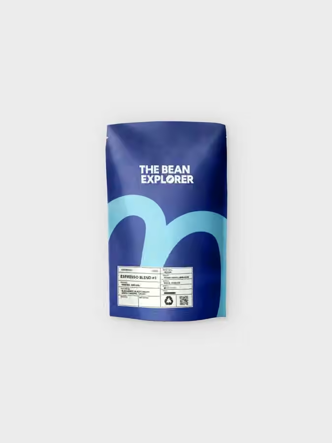
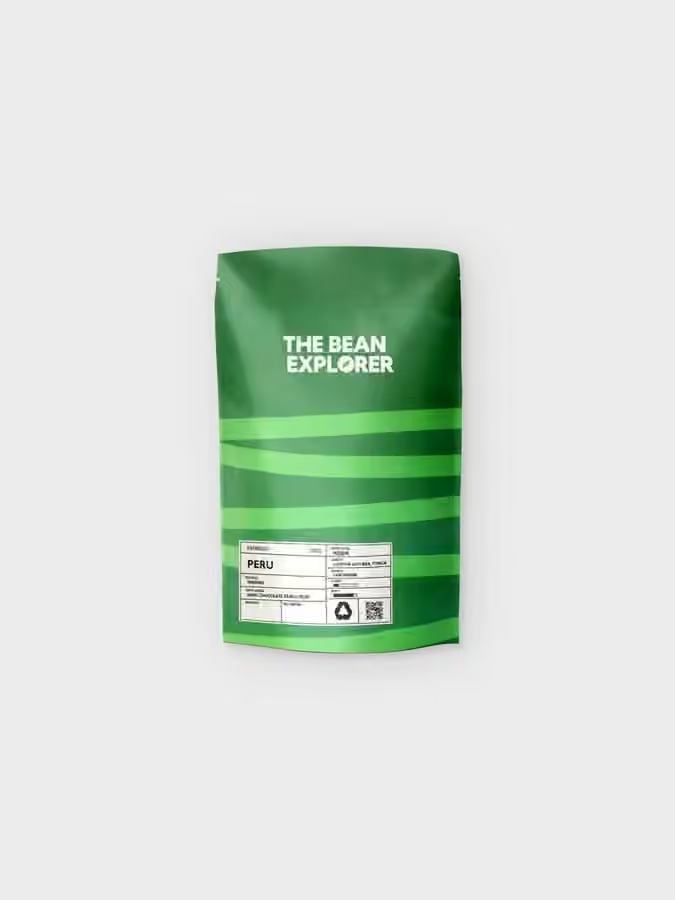
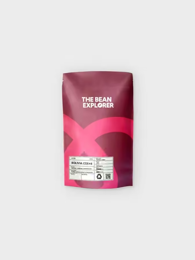
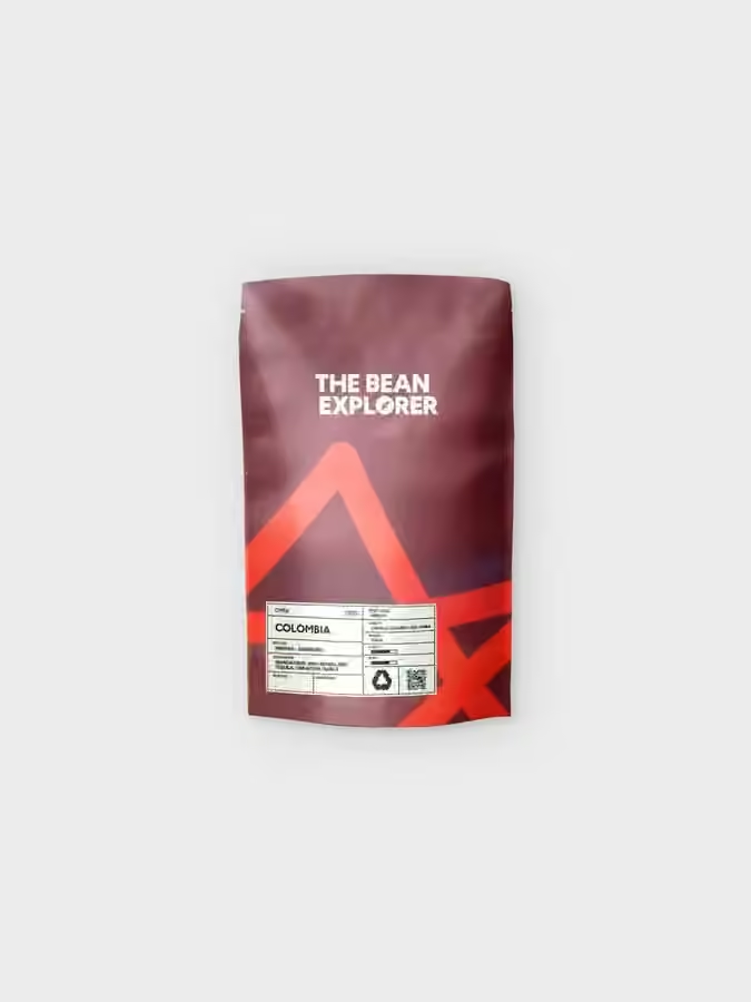
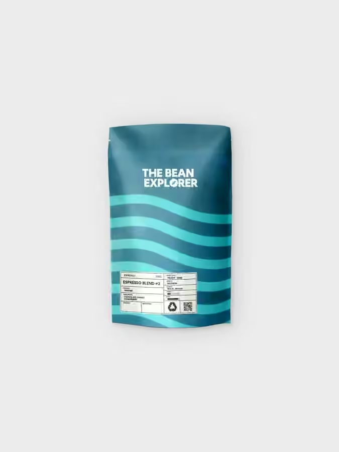
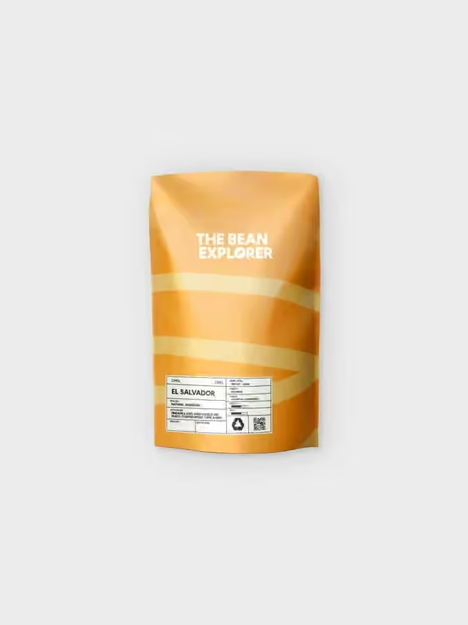
Strong color differences make the range navigable from a distance; the shared typographic and graphic architecture keeps every pack inside one recognizable brand world. The point is not color for color's sake. It is to make variety feel exciting without making the shelf feel chaotic.
Beyond the bag
The web concept extended the same exploration logic into beans, equipment, subscriptions, rental and education. Physical presence did the same at events and retail touchpoints. The visual identity was therefore built as a language that could keep producing new chapters rather than a fixed launch campaign.
The first impression is energetic and easy to enter, not coded for insiders only.
Color and repeatable layout rules make a growing product range easier to scan and remember.
Packaging, content, subscription and equipment all point toward another reason to stay in the brand world.
Selected applications
The wider direction covered packaging, print, the digital shop and content architecture, subscription logic, espresso-equipment rental, educational storytelling and physical brand presence. These images focus on the identity and packaging layer because it is the clearest visual excerpt of a much broader system.